


AltAle
AltAle


Alternative Aleworks aka Alt Ale
Fill.Drink.Repeat
Branding & Identity
The objective for this project was to create any business of your liking and in turn brand that business. Things to consider when doing so, what makes your store different and separate itself from the rest? And how will your store be more successful because of its branding?
Alt Ale is a San Francisco based microbrewery. The full name Alternative Aleworks is based on its specialization in gluten free beer. Hence the tagline, "The Art of Brewing an Alternative Lifestyle." The Bay Area has always been a center destination within the ripple effect of trends. Lately people have shifted to alternative nutrition habits based on their knowledge and the rise of those who are gluten intolerant. I myself have many friends who suffer from this and because of it have formed my business and mission statement to be; "All of Alt Ale's beer are artfully brewed to house the traits of the alternative lifestyle, 100% gluten free beer and appetizers. A place designed for the gluten intolerant, friends of the gluten intolerant, or those who just enjoy a great tasting beer in the greatest city of all time."
The hops bud became the logomark to represent the gluten free beer while the logotype is simple and edgy, like the city Alt Ale would reside in. The animal characters on the other hand are more complex, representing each individual type of beer and it's atypical ingredients.
WXED
WXED
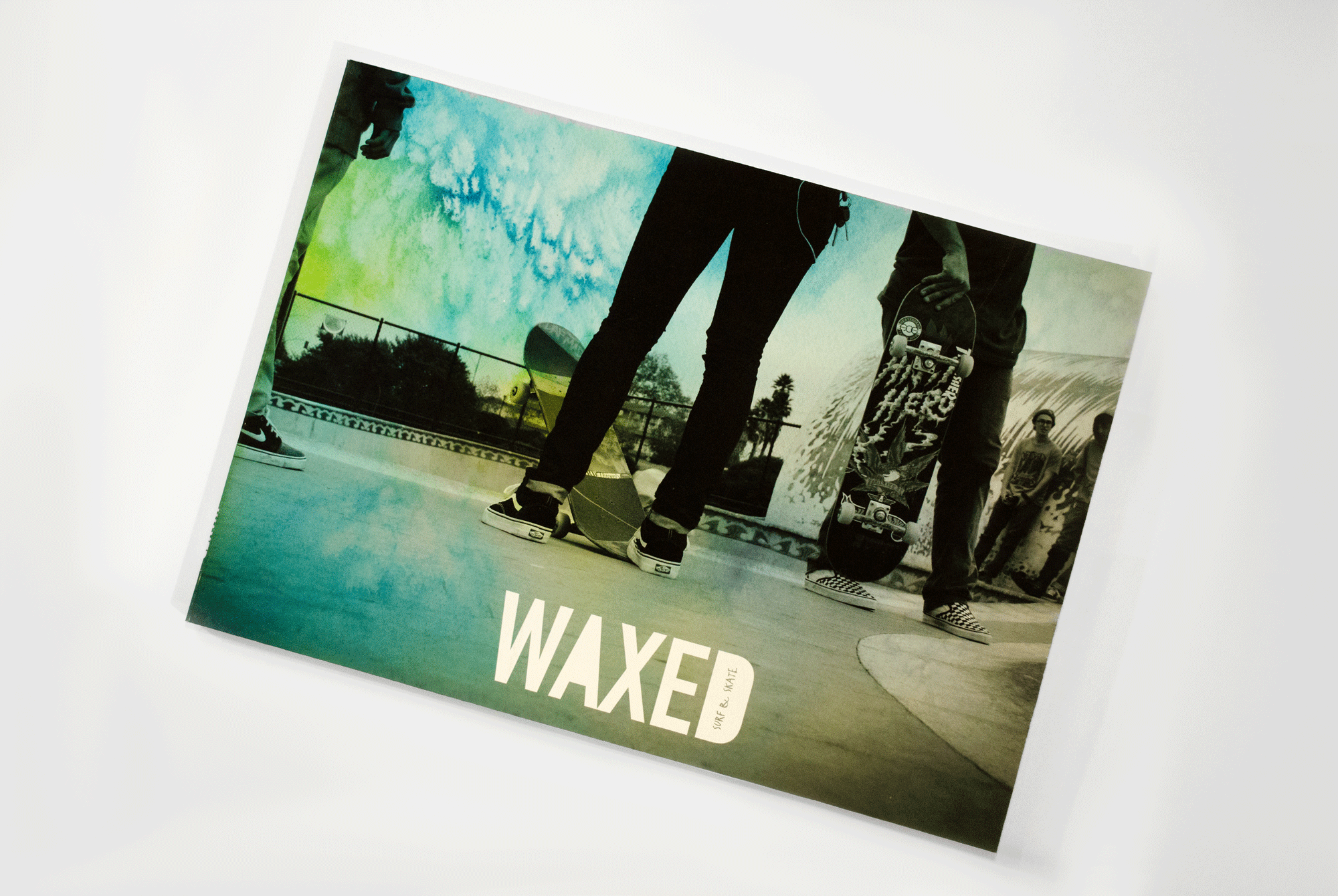
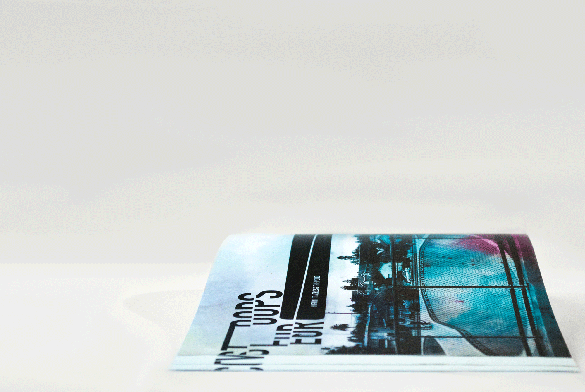
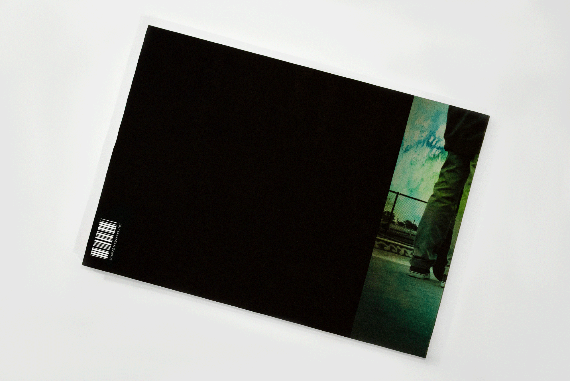
WAXED
Surf & Skate
Magazine Redesign
The purpose of this project was to redesign a magazine issue with the intention of improving the overall aesthetic as well its function.
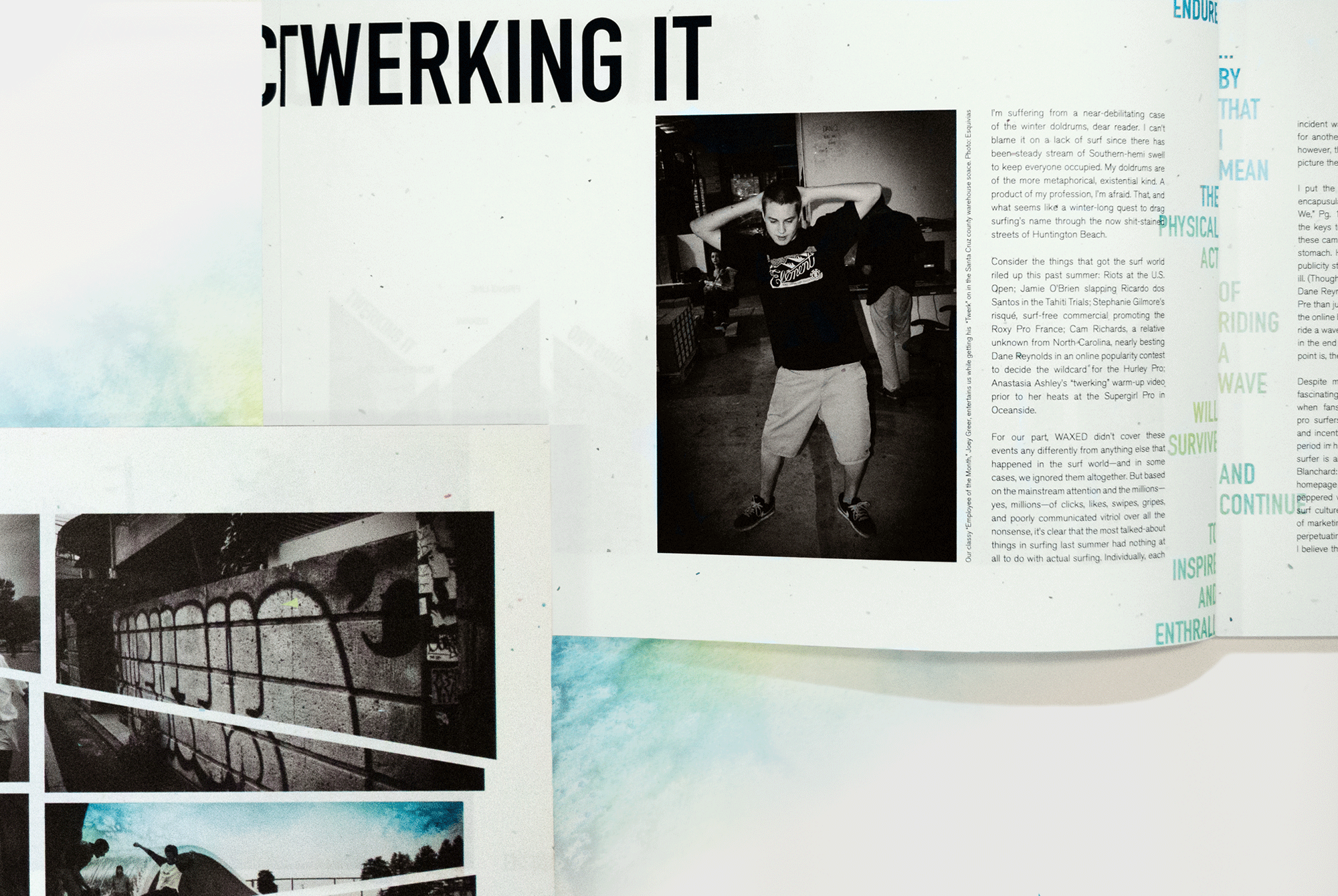
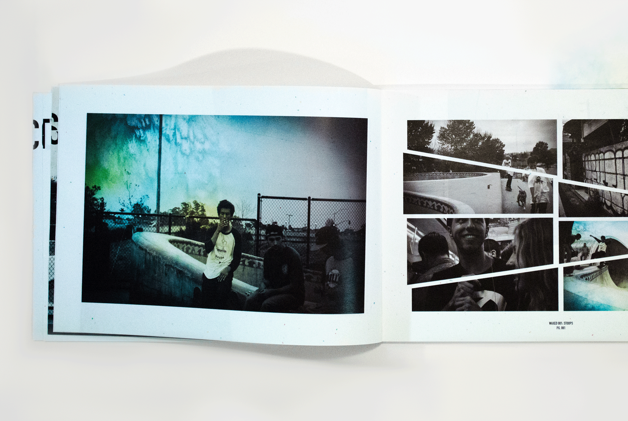
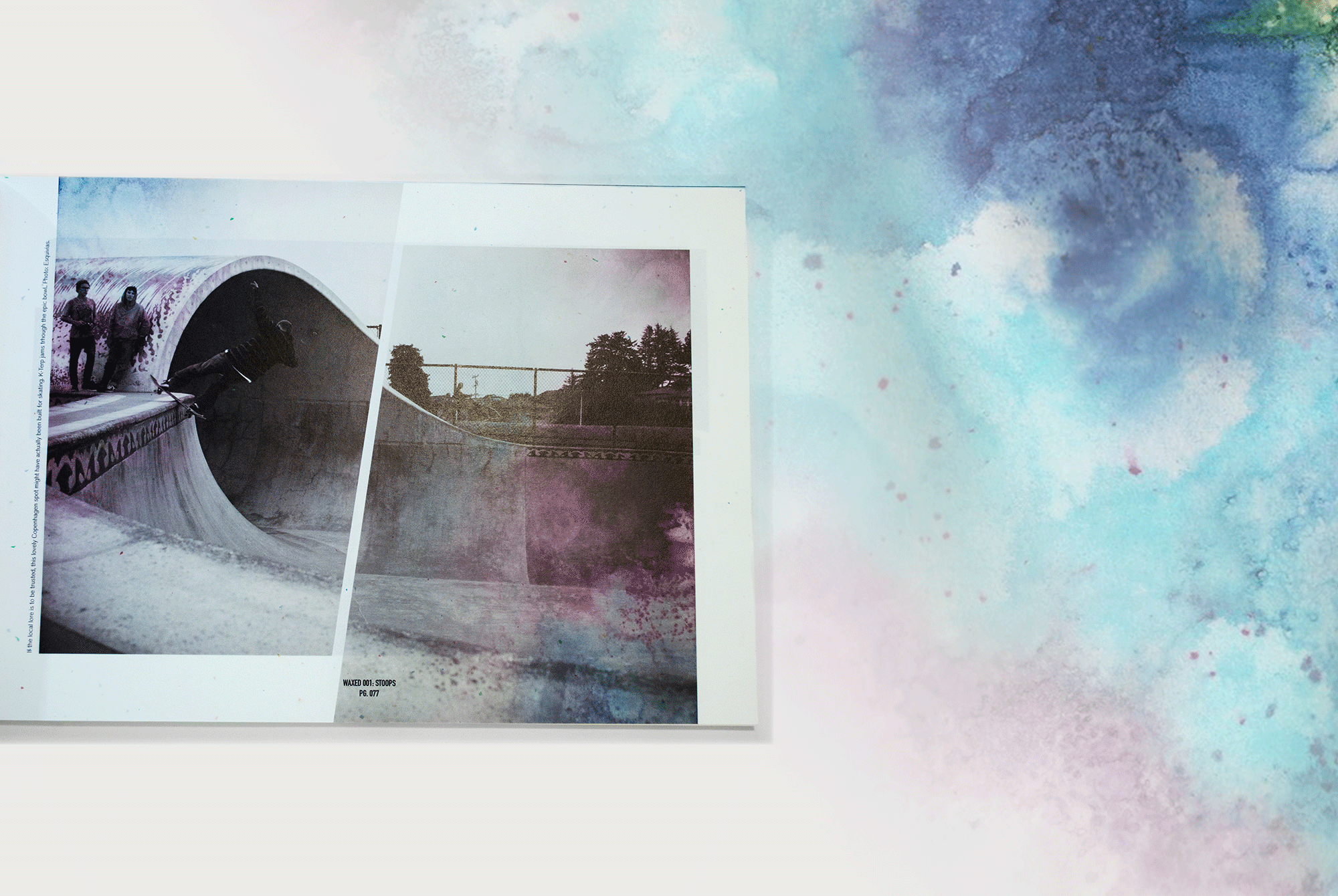
I chose two magazines (rather then one) to combine, creating a whole new breed called WAXED. The original magazines it took to create WAXED were Thrasher and Surfer. The originals, especially Thrasher were very chaotic. I looked to refine the magazine by combining the rebellious and loud culture of the two sports through a calmer voice that gave room to breathe and soak up the information.
CA State Parks
CA State Parks


CA State Parks
Adventure Starts Here
Branding & Identity
The rebranding of the entire California Department of Park's and Recreation's identity to enhance their beauty and entice people to experience what they have to offer.
Growing up in the Santa Cruz Mountains I have had the great fortune of experiencing California's natural beauty hands on almost every day as a kid. The sweet simplicity and deep calm the forest can give you is incredible. The Redwood Forests were a huge inspiration to my design. I wanted the logo to reflect the simplicity of nature, yet with a contemporary and timeless twist.
PrettyLights
PrettyLights


Pretty Lights
A Color Map of the Sun
Concert Poster
Derek Vincent Smith is American electronic music artist who performs under the stage name of Pretty Lights. The posters are meant to represent his digital sampling and crossing of many genres, forming a combination of glitchy hip-hop beats, buzzing synth lines, and vintage funk and soul samples.
Insght
Insght


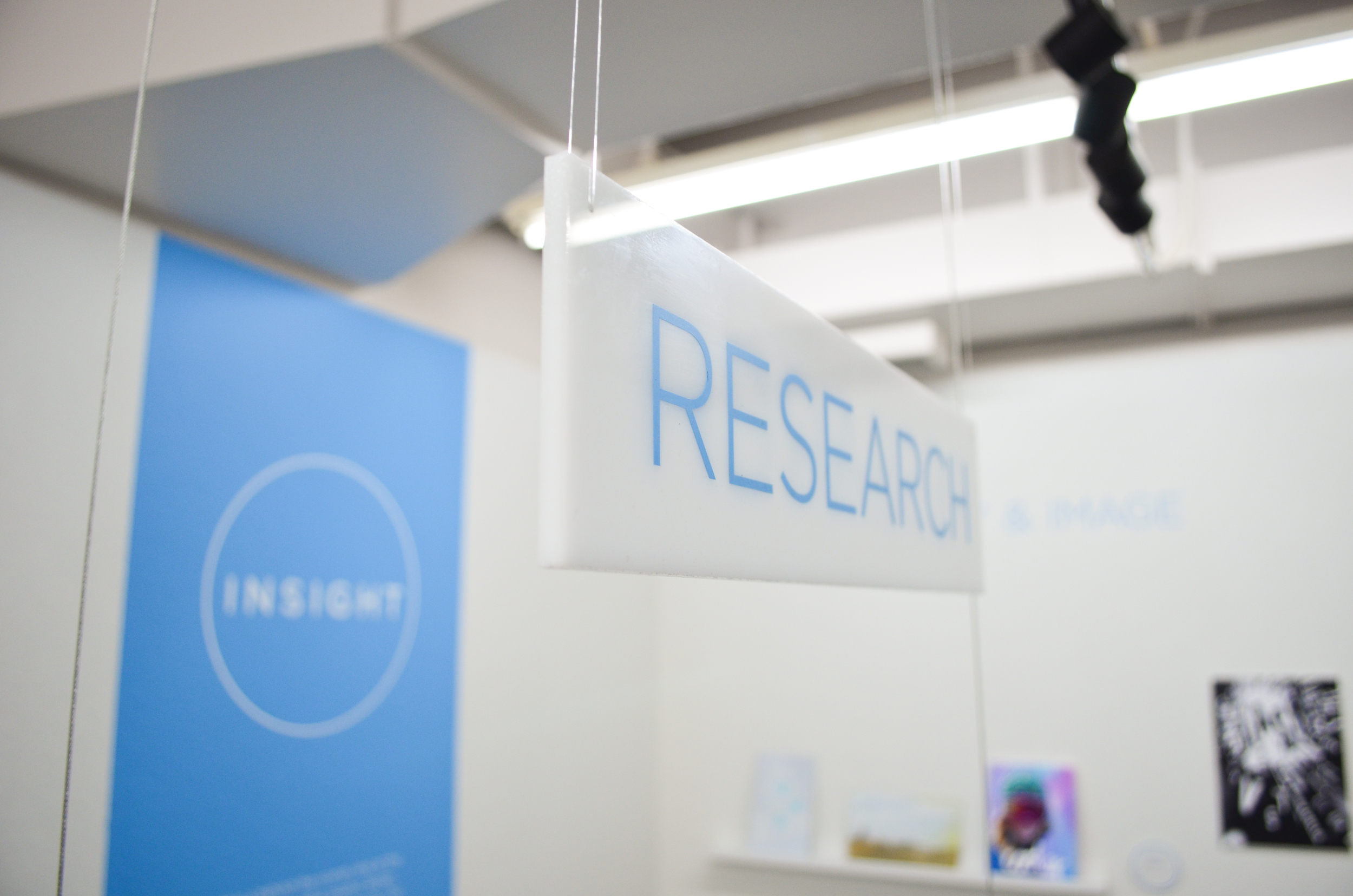

Insight
9 Designers 9 Processes
Exhibition
The purpose of this exhibition was to give a behind the scenes look into the creative process of a graphic design student at San Jose State University. We wanted to take the viewer down our creative path of research, sketches, and iterations and show them the side of design that many don't get to see or truly understand. The raw, un-manipulated process in beautiful form.
Team: Brandon Boswell, Glenn Cardenas, Stefanie Galvan, Jono Heath, Esther Tseng, & Maya Yama.
Dahmer
Dahmer
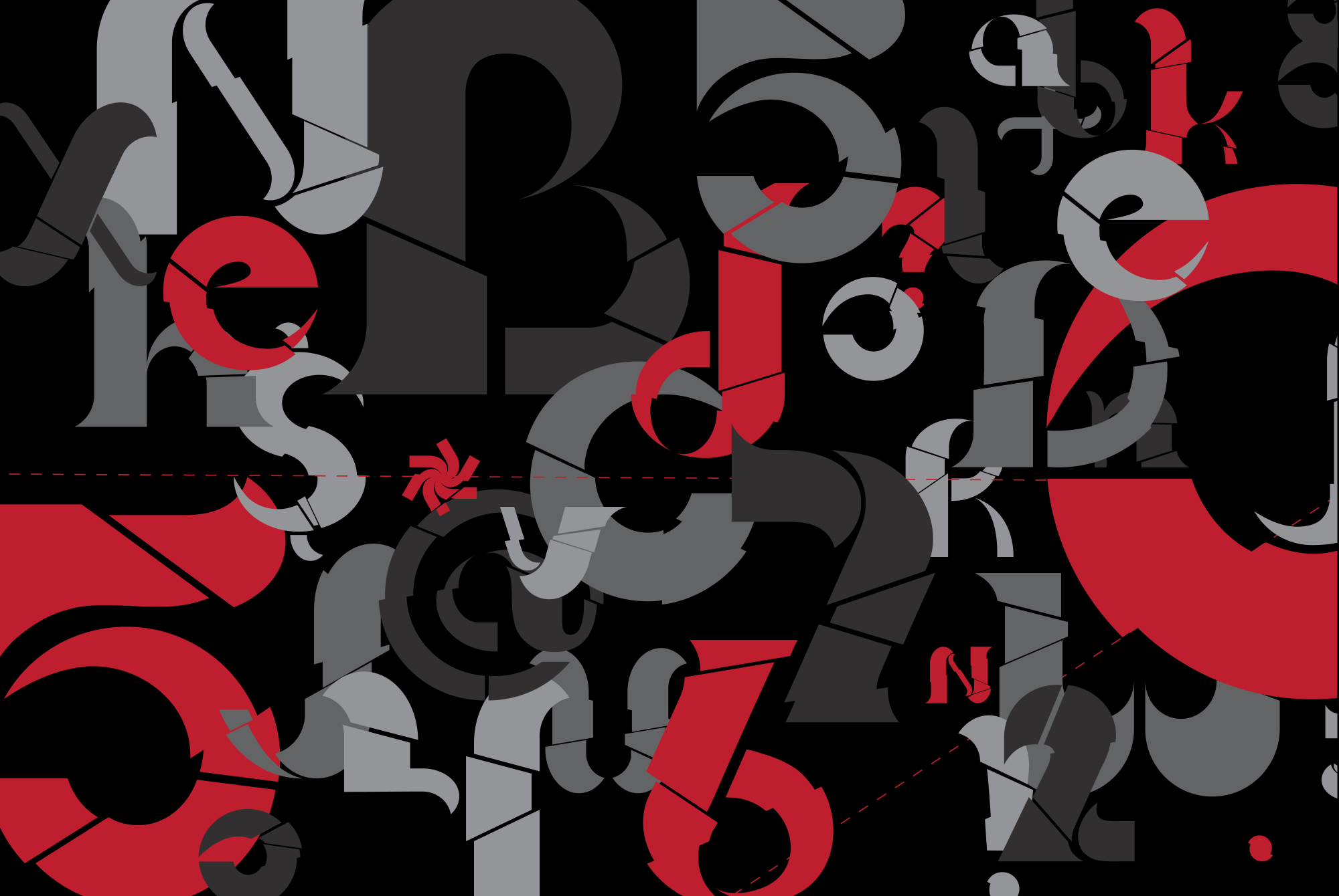
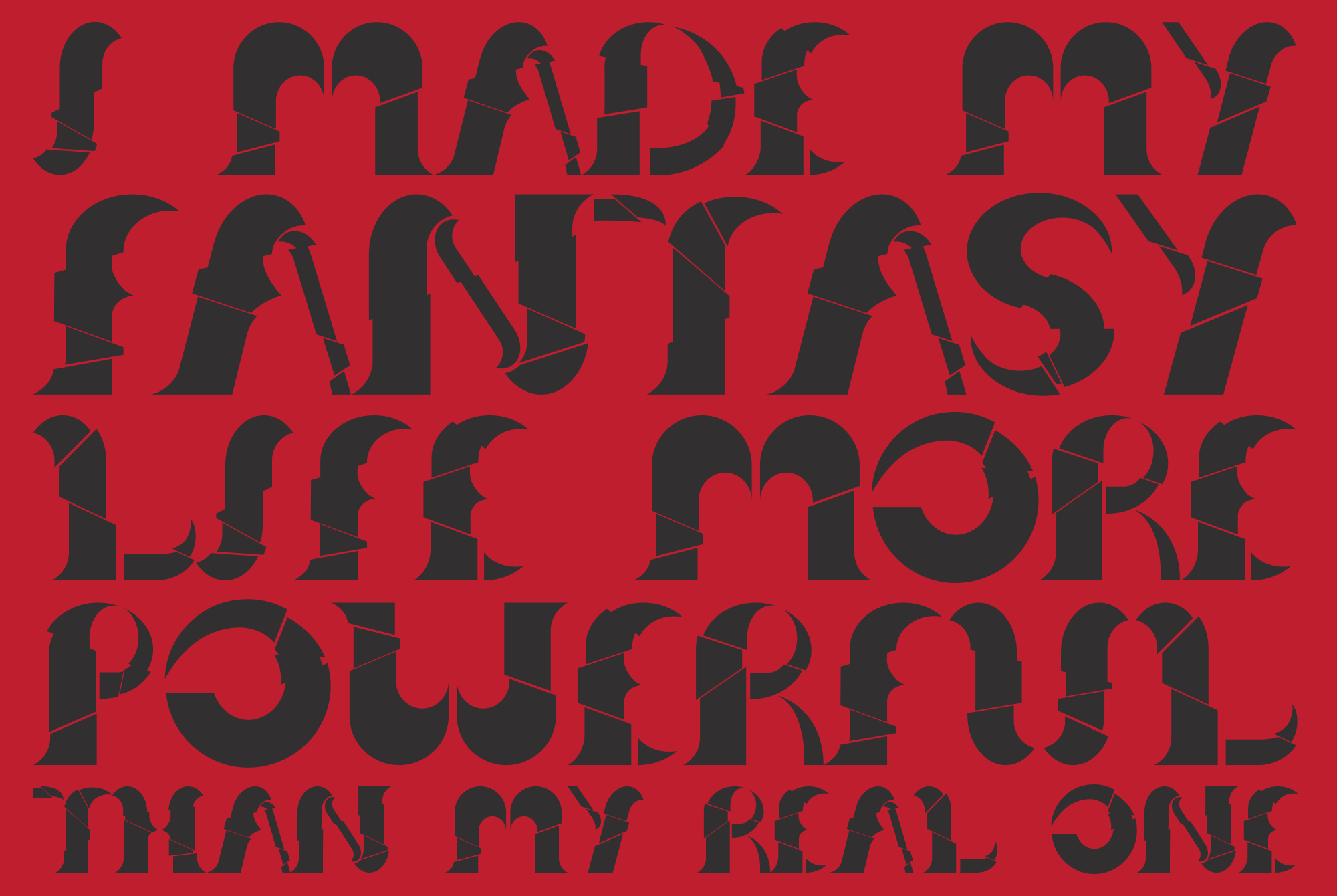
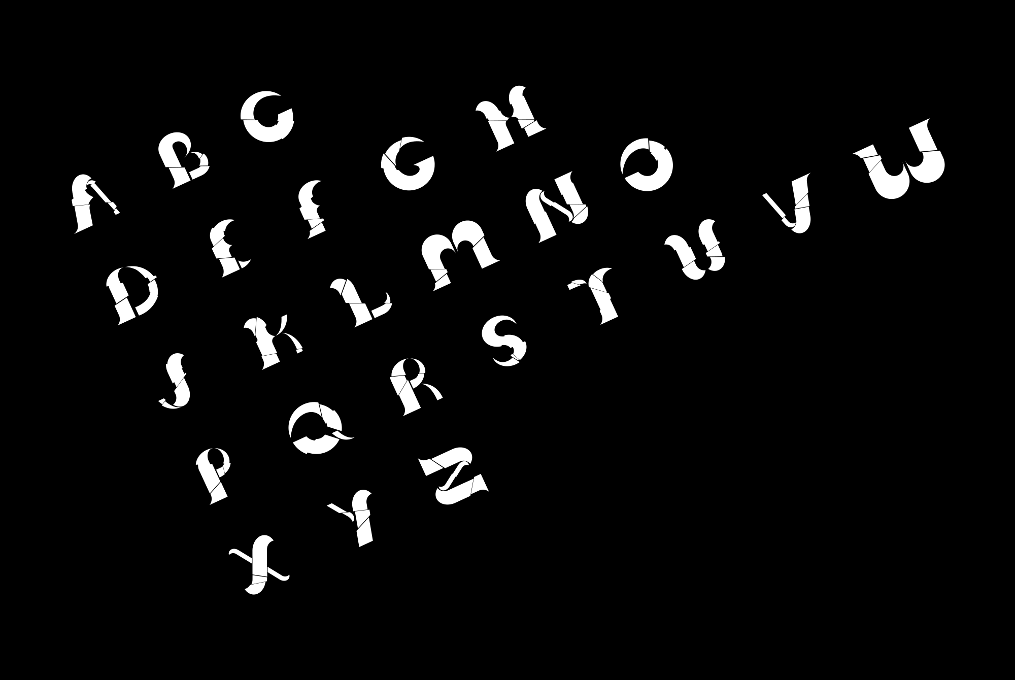

Dahmer
Murder He Wrote
Typeface Design
The objective for this project was to design a typeface based on the entire entity of one person. Things got weird for a moment and I chose the infamous serial killer Jeffrey Dahmer. The characters were not only meant to act as his victims; showing how he sliced and diced each one individually to his dark, twisted satisfaction, but to also demonstrate his multiple personalities.